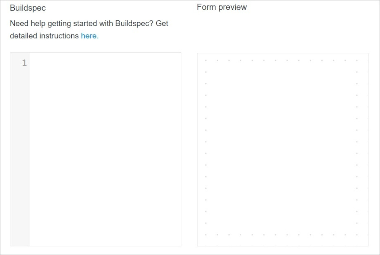
Buildspec
Solodev Buildspec is a specialized set of build commands and settings for creating custom forms. With Buildspec, users can define form fields, capture form answers, and provide values for specific applications. It utilizes clear and simple YAML syntax and is being used in various places in the Solodev Cloud.
For example, users with a Marketplace Seller subscription can use Buildspec to customize their forms: allowing them to define the questions they need to ask buyers when configuring services in the Solodev Store. They can also use Buildspec to collect and pass values for various parameters in AWS CloudFormation Templates.
Anywhere that questions need to be asked: or answers provided: Buildspec can be used to customize a form and capture the necessary information.
With Buildspec, you can put your form into a structure, using such elements as panels, columns, dividers, or headers.
The basic structure of the content follows this format:
form: // beginning the form definition section
- id: {name} // unique identifier of the field
    type: {field_type} // type of the field
    label: {Some Label} // label connected with this field
    description: {Test description for the name field} // helper text displayed under the label
    required: {true|false} // requirement flag
    autofocus: {true|false} // this field will gain focus right after the page load
    hideLabel: {true|false} // if you need to turn off the label
    placeholder: {Placeholder text} // useful with input or dropdown fields
- id: {name}
    ...
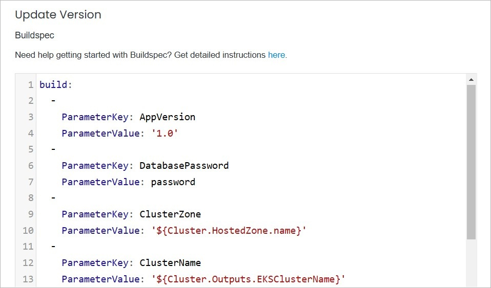
Using the build param, you can provide default values for questions asked in AWS CloudFormation Templates. The basic structure of the param looks like this:
build: // beginning of the build section
-ParameterKey: AppVersion // key of the parameter
 ParameterValue: latest // value of the paramter
-ParameterKey: DatabasePassword
...
Field types
Field types are different kinds of question formats that a user can assign to a form. The type section controls how the questions are formatted in the UI as well as the types of responses that are expected or required.
Available formats include:
-hidden: No field will be shown in the UI, but the value will be stored in the form.
-string: A textbox will be shown in the UI to capture the answer, and the answer will be formatted to a string.
-clob: A text area will be shown in the UI to capture the answer, and the answer will be formatted to a multiline string.
-email: Behaves just like a string type, but with e-mail address validation.
-password: A password style of the textbox will be shown in the UI to capture the answer, and the value will be dotted and formatted to a string.
-url: Behaves just like a string type, but with the URL validation.
-boolean: A checkbox will be shown in the UI to capture the answer, and the answer will be entered as true if the checkbox is selected or false otherwise.
-enum: A drop-down menu will be shown in the UI and the options section will be populated in the menu. The multiple options set to true will enable a multiple-choice type of drop-down, while the expanded option set to true will change the dropdown into a radio button group.
-color: A color picker will be shown in the UI to capture the answer, and the answer will be formatted to the string with a # sign at the beginning.
-date: A date picker will be shown in the UI to capture the answer, and the value will be formatted to the string.
-tel: Behaves just like a string type, but with telephone number validation (ie. digits and dashes).
-datetime: A date-time picker will be shown in the UI to capture the answer, and the value will be formatted to the string.
-time: A time picker will be shown in the UI to capture the answer, and the value will be formatted to the string.
-integer: A number picker will be shown in the UI to capture the answer, and the value will be validated to confirm if it is an integer.
-money: Behaves just like a string type but with number validation and a  $ sign that precedes the textbox.
-number: Behaves just like a string type but with number validation.
-percent: Behaves just like a string type but with number validation and a  % sign that follows the textbox.
Here's an example of a complete Buildspec with field types:
form:
  - id: secretToken
    type: hidden
    hideLabel: true
  - id: name
    type: string
    label: My Name
    description: Test description for the name field
    required: true
    autofocus: true
  - id: description
    type: clob
    label: Description
    description: Test description for the description field
    required: false
  - id: email
    type: email
    label: Email
    description: Give me your email so that I may spam you
    required: true
  - id: password
    type: password
    label: Password
    description: I want access to all your data
    required: false
  - id: website
    type: url
    label: Web site
    description: What is your website?
  - id: blahEnabled
    type: boolean
    label: Blah Enabled?
  - id: favoriteFood
    type: enum
    placeholder: -- Please choose one --
    options:
      expanded: false
      multiple: false
      choices:
        American: american
        Chinese: chinese
        French: french
        German: german
        Italian: italian
        Japanese: japanese
        Korean: korean
        Other: other
        Polish: polish
    label: Favorite Food
    description: What's your favorite type of food?
    required: true
  - id: favoriteColor
    type: color
    label: Favorite Color
    description: What's your favorite color?
  - id: dob
    type: date
    label: Date of Birth
    description: When did you awake from the eternal sleep?
  - id: homePhone
    type: tel
    label: Home Phone
    description: >
      I need your home phone so that I can sell this to robocall
      companies.
    placeholder: ex. 555-555-1234
  - id: expiration
    type: datetime
    label: Expiration Date
    description: >
      I'm not sure what is expiring but at least
      tell me when it should.
    placeholder: yyyy-MM-dd HH:mm:ss
  - id: bestTime
    type: time
    label: Best Time
    description: >
      What time of the day is the "best time"?
  - id: numCars
    type: integer
    label: Number of Cars
    description: >
      Tell me how many cars you own so I can sell
      this information to auto dealers.
    placeholder: ex. 2
  - id: salary
    type: money
    label: Annual Salary
    description: >
      Tell me your salary so can I sell this
      information to sleeze finance types.
  - id: randomNumber
    type: number
    label: Random Number
    description: >
      Pick a number game. Can you guess it?
      You won't win anything regardless.
  - id: testPct
    type: percent
    label: Chance of Escape
    description: >
      What do you think your chances are of
      getting out alive? (creepy)
Buildspec Management
Buildspec is available for use in the Item Overview page. There you can create and modify Buildspec formulas.
Note:
The specificity of use Buildspec depends on the fulfillment type. In the all fulfillment types apart from Service you are able to modify Buildspec within the item versions.
Service Fulfillment Type

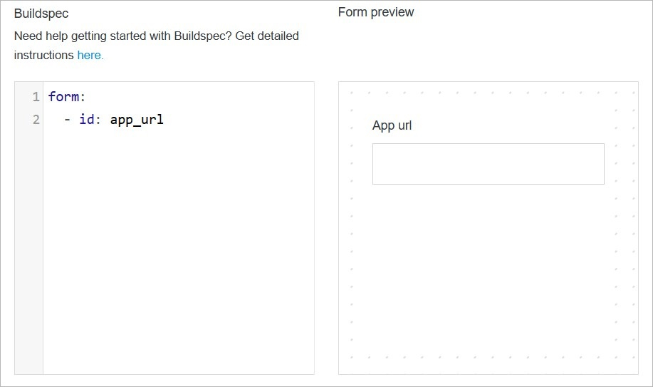
Example of formula 1:

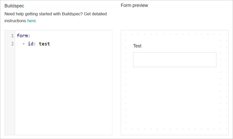
Example of formula 2:

Rest of fulfillment types

Confirm
Once you have completed all the fields, click Save to apply your changes.